(Valid for Graphite version 0.1)
The following steps through the example explaining each piece. While creating this example graph the following commands at the python interactive prompt were very helpful.
>>> from graphite import *
>>> print Axis().help()
Class: Axis
	Purpose: defines the extent, type, and appearance of an axis

Properties:

   drawPos (any): location in view coordinates where the axis should be drawn
   label (Text): axis label
   logbase (float): LINEAR, or a log base (e.g., 10 or math.e)
   range (any): data range of the axis; [None,None] means auto range
   visible (bool): whether or not the axis should be drawn at all
   tickMarks (list of TickMarks): list of TickMarks objects attached to this axis

>>> print TickMarks().help()

Class TickMarks
        Purpose: keeps information about a set of tick marks -- how big
                         they are, the spacing, labels, etc.
        Notes: we may have to deal better with overlapping tickmarks later.

Properties:

   labeldist (float): distance from axis in view coordinates where labels should be placed
   inextent (float): length (towards center) of marks, in view coordinates
   spacing (any): distance between the tick marks in data coordinates, AUTO for automatic
   logsteps (int): number of sub-steps within one base cycle on a log axis, or 0 for default
   lineStyle (LineStyle): style of the tickmark lines
   labelStyle (TextStyle): text style of tickmark labels
   offset (float): distance from the origin (in data coordinates) before the tick marks start
   outextent (float): length (away from center) of marks, in view coordinates
   labels (any): tickmark labels: None, AUTO, a format string, list of strings, or function


>>> print BarPlot().help()
Class BarPlot
	Purpose: defines a format (methods and parameters) used to draw
			 a bar chart of a data series.  Actually, it just draws
			 one uniform set of bars; it will work in conjunction
			 with other BarPlots to produce a completed bar chart.

	Notes: there is currently no good way to specify that 'shift' and 'size' should
		   be auto-set by looking at all bars on the plot.  This needs to be fixed.

Properties:

   fillStyle (Color): style (for now, just color) used to fill the bars
   lineStyle (LineStyle): style used to outline the bars, or None if no outlines are desired
   axis (enum): in which axis the bars extend
   base (float): base value (in data coordinates) of the bars
   shift (list of 3 float): position shift applied to each bar (in data coordinates)
   size (list of float): x,y,z size of bars (in data coordinates)
from graphite import *
# create a graph
g = Graph()
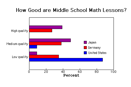
g.title = Text('< b > How Good are Middle School Math Lessons? < /b >',
pos=(0.5,1.1,0))
This section of code makes room for the title. The default positions for
the graph on a
piddle campus don't leave enough room. There is also a g.left and g.right.
	g.bottom = g.bottom + 40
	g.top = g.top + 40
Now let's add 3 XY datasets.
	# Japanese percent goodness
	g.datasets.append( Dataset((39,3), (49,2), (9,1)) )
	# German percent goodness
	g.datasets.append( Dataset((27,3), (38,2), (35,1)) )
	# United States percent goodness
	g.datasets.append( Dataset((0,3), (9,2), (87,1)) )
Along the X axis we are graphing a percentage, so the X axis range should go from 0 to 100 and we should label it accordingly.
	g.axes[X].range = [0,100]
	g.axes[X].label = Text('Percent', pos=(0, -0.1, 0))
The below lines
create a set of
tickmarks for the X axis and set the spacing to 20. The
labels are set so that the values
at tickmarks will be formatted as integers.
	xticks = TickMarks()
	xticks.spacing = 20
	xticks.labels = "%d"
	g.axes[X].tickMarks = [xticks]
Now we set the Y axis range.
g.axes[Y].range = [0,4]We don't want a Y axis label so we have to override the default with an empty string.
g.axes[Y].label = Text('', pos=(0, -0.1, 0)) # no Y label
Now we create a set of tickmarks for the Y axis.
	yticks = TickMarks()
	yticks.spacing = 1
	yticks.labels = ['','Low quality', 'Medium quality', 'High quality']
	yticks.labeldist = -0.14
	g.axes[Y].tickMarks = [yticks]
The graph contains 3 datasets. Here we are setting up 3 different plot types. The size and the shift fields are used in the BarPlot() to organize the bar placement. We are currently setting these values by hand to get bars which are side-by-side.
	purplebars = BarPlot()
	purplebars.axis = X
	purplebars.fillStyle = purple
	purplebars.size[Y] = 0.25
	purplebars.shift = (0,0.25,0)

	redbars = BarPlot()
	redbars.axis = X
	redbars.fillStyle = red
	redbars.size[Y] = 0.25
	redbars.shift = (0,0,0)

	bluebars = BarPlot()
	bluebars.axis = X
	bluebars.fillStyle = blue
	bluebars.size[Y] = 0.25
	bluebars.shift = (0,-0.25,0)

	g.formats = [purplebars, redbars, bluebars]
Finally, we also add a legend by hand using overlays and some of the graphic primitives found in primitive.py.
	##### the legend, doing it by hand

	# purple box
	g.overlays.append( Box((0.65,0.5,0),(0.68,.55,0),fillStyle=purple) )
	g.overlays.append( Text('Japan',pos=(0.70,0.50,0),
			style=TextStyle(hjust=LEFT,vjust=BOTTOM,font=Font(size=10) ) ) )

	# red box
	g.overlays.append( Box((0.65,0.4,0),(0.68,.45,0),fillStyle=red) )
	g.overlays.append( Text('Germany',pos=(0.70,0.40,0),
			style=TextStyle(hjust=LEFT,vjust=BOTTOM,font=Font(size=10) ) ) )

	# blue box
	g.overlays.append( Box((0.65,0.3,0),(0.68,.35,0),fillStyle=blue) )
	g.overlays.append( Text('United States',pos=(0.70,0.30,0),
			style=TextStyle(hjust=LEFT,vjust=BOTTOM,font=Font(size=10) ) ) )
Then we use genOutput to create a PDF file.
genOutput(g,'PDF')